Ask a Designer: 2014 decor trends
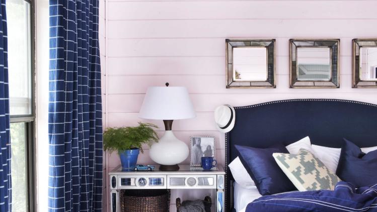
With a new year come new trends in home design and decorating. Among them: paler walls contrasted with colorful furniture, and plenty of personal expression, design experts say.
COOLEST COLORS
Whisper-soft, ultra-pale shades of pink —described by designers as “blush tones” — are back. But the ’80s haven’t returned, says designer Brian Patrick Flynn says, at least not entirely.
“What’s different about blush this time around is what it’s paired with. In 1985, you’d find it paired with mauve and black with tons of shiny brass accents. Flash forward to today and blush is likely to be paired with preppy, masculine tones,” says Flynn, founder of Flynnside Out Productions.
His favorite blush paint is Barely Blush from Glidden, which he contrasts with navy blue: “The deep, rich personality of the navy actually washes out the blush, almost causing it to look white, and the overall effect is fresh and gorgeous.”
Speaking of white walls, Los Angeles-based designer Betsy Burnham sees those coming back in a big way.
“I used to think white walls looked unfinished,” she says. “But I’ve completely come around on this one, because white is the ultimate palette cleanser. It gives every space — even the most traditional — a modern edge, and sets the stage wonderfully for layers of color in upholstery, accessories, area rugs and art.”
But while wall colors are getting softer and paler, the opposite seems to be happening with furniture.
“Strong colors on upholstery are becoming more of the norm,” says Kyle Schuneman, founder of Live Well Designs, who spent a chunk of 2013 designing his first line of furniture, in collaboration with retailer Apt2B.
He opted to create sofas in bright blues and shades of orange because “a bright sofa is no longer just for a creative office waiting room,” he says. “People are bringing them into their homes.”
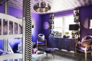
One bold color to approach carefully this year: red-violet. “Red-violet is the Pantone color of the year for 2014,” Flynn says. “As a designer whose specialty is using color, let me tell you something: Red-violet is about as complex as it gets.”
“My trick for using it right is pairing it with black, white and brass,” he says. “It’s not all that overwhelming, since it’s balanced by the neutrality of the black and white, and made a bit more chic and regal with the brass.”
TOP TEXTURES
“For accessories, the trend seems to be getting away from color and going more into rich textures like horn, aged metallics and linens,” Schuneman says. “The absence of color is becoming chic for smaller items.”
One texture Flynn says will have a big moment in 2014: felt.
“Have you looked at Pinterest lately? It’s like every fifth photo you see involves felt! Ever since the handmade movement kicked in back in 2010, felt has been used in unexpected ways and in a modern fashion,” Flynn says. “What makes it such a favorite for designers is how easy it is to work with. It’s amazing for door upholstery due to its stiffness. It makes for awesome craft material, since it’s easy to cut and stitch, and it’s awesome for kids.”
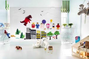
An easy project for even the DIY-challenged: “I modernized the classic kindergarten felt wall in a boy’s room by covering a wall with batting, then literally upholstering it with white and blue felt, then cutting tons of felt into random objects and characters to give the kids something interactive and stylish.”
FRESH INSPIRATIONS
“The idea of personalization is becoming stronger and stronger,” Schuneman says. “People are wanting their homes to reflect a more unique perspective.”
So rather than assuming that everyone will be buying the same popular items, “stores are doing limited runs on items more often, like art in series or a special brand collaboration for just a season,” he says.
Burnham agrees. Homeowners are increasingly looking to “large-scale wall hangings” and other pieces of art to express themselves, she says, rather than doing it with bold wall color.
“Boy, am I sick of accent walls. I really believe that trend is out! I vote for art every time,” Burnham says. “If you’re looking for something to cover big, blank areas, shop on Etsy for macrame pieces. They add such wonderful texture to your walls, and artists like Sally England have brought them back into vogue.”
She also recommends hunting for vintage posters that speak to you. Find them through online dealers and auction houses, and then frame them in a group.
“While the vintage ones are a bit of an investment,” Burnham says, “they can be a lot more reasonably priced than large-scale paintings and photographs.”
Another way Americans are increasingly customizing their space, according to Flynn: Western-inspired décor.
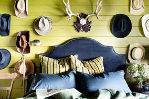
“For years I’ve seen taxidermy make its way into mainstream design, yet reinvented in new ways. Lately, I’ve been looking to Ralph Lauren-like cabins of the Western United States for inspiration in my own home. I think a lot of cabin-inspired colors such as pea greens, hunter greens and camouflage-inspired prints will become super popular.”
Flynn’s cabin in the north Georgia mountains is currently decorated in pea green and accented with heavy, masculine fabrics, Western hats and antlers.
TACKLING AWKWARD SPACES
“Tons of new-construction homes have awkward bonus rooms” that homeowners aren’t sure how to furnish, Flynn says.
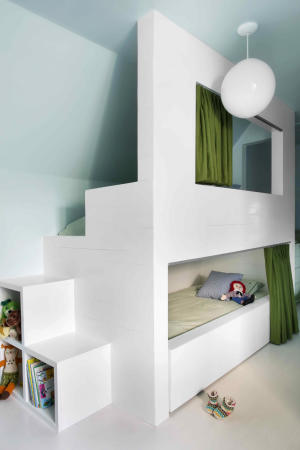
One suggestion: “Why not turn that space into an extra sleeping area that can accommodate multiple guests, but in a super-stylish, architectural manner? That’s where the art of built-in bunks comes in,” Flynn says.
“I turned a dated attic into a bunk room and play space for two young brothers by using one wall as floor-to-ceiling, mid-century-style bunks. This isn’t exactly cheap to do, but it’s well worth the investment since it maximizes space and adds an architectural focal point, albeit one that’s functional, to otherwise dead space.”


Leave a Reply